
Quills & Pixels
A Peer-Reviewed Journal of Nonfiction Writing


The Course
RHET 5347 Topics in Nonfiction Writing: Quills & Pixels is a course taught in the Department of Rhetoric and Writing at the University of Arkansas at Little Rock that gives students the opportunity to gain editing and design experience by working as staff on the department’s annual peer-reviewed publication, Quills & Pixels. The course spans two semesters, with the first semester focusing on the acquisition of pieces for the journal and the second semester is dedicated to editing the accepted submissions and designing the journal.
Call to Adventure
When I started working on my master’s in professional and technical writing, I choose the nonfiction concentration with a focus on digital publishing. This course was offered as part of that learning track. I missed the first course offered during the fall semester where the students acquired and conducted substantive editing on the pieces for the journal offered in the fall of 2012, but fortunately students are allowed to join the staff during the spring semester to help copy edits, proofreading, and journal design.
The journal was supervised by Dr. Charles Anderson, a seasoned editor with extensive experience in publishing, and managed by the students. Dr. Anderson was great at making sure Quills & Pixels was a complete collaboration by all of the students from the theme development to the journal’s design.
Cue the Montage
Variations on a Theme
All of the students in the class were asked to create a Table of Contents for the journal. As I read through the entries, I looked for a theme among the individual pieces and an overarching theme for the collection. I wrote all the titles on individual notecards with a few keywords so I would remember what each piece was about.
Looking at the different groupings, it felt like a progression of macrocosm to microcosm; of starting outside of one’s self and moving inwards. I think people have a tendency to look outside of themselves for a lot of things (comfort, gratification, importance, etc.) and we tend to place these personifications on objects. For instance, a child might find comfort in a favorite blanket or toy. Later, we apply these feelings to living creatures (plants and animals). After a while, we start to look inside and rely less on things from the outside. During this transitional phase, I think creative ideas develop and we start to create. Then, we start to look inward and we start to rely more on our strengths for support. Finally, we share ourselves with the world and strive to make changes that can positively affect others.
Starting with the overarching themes, I looked for an order that would thread individual pieces together and help segue into the next section. As I reviewed at my groupings, I wanted to start the book strong (with what I felt were strong pieces) and end the book strong on an up-note. I placed weaker pieces toward the middle of the book or between strong pieces in the individual sections.
The section title is followed by a narrative definition of the section. I was thinking each section in the book could have a page with just the title and the “definition” as a way to introduce each section (see Fig 1).

Fig. 1. My sample table of contents for Quills & Pixels, 2013
The class decided that the best theme was Voice created by Bethany May. The headers and arrangement were modified slightly for better flow and the class had our finalized Table of Contents (Fig. 2). Several of the students liked the definitions I used in my arrangement, so we added a similar narrative element to the section dividers in the final journal (see Fig. 5).

fig. 2. final table of contents originally created by bethany may, Quills & Pixels, 2013
Planning the Layout
Our next task was creating layouts for the journal pages. The entire class was asked to create sample pages in InDesign. Each section began with a single section divider page (Fig. 3) followed by the works for that section. The journal from the previous year used a two-column layout and a lot of pull-quotes, so I wanted to include those elements in my design for a bit of consistency (see Fig. 4).

Fig. 3. Section divider page and sample master page layout, Quilss & Pixels, 2013
In creating the layout for the various page elements, I took a lot of inspiration from innovative layouts from famous books. The arrangement of the author’s names and titles were inspired by Haruki Murakami’s novel IQ84. In one version of the print book, the title of the book, IQ84, is used like an icon and the page numbers line the right and left margins of the page. As the reader turns each of the pages, the numbers move up and down the margin. There are other interesting visual easter eggs hidden in the design of the book that relate to the plot of the novel.
I liked the idea of using the left and right margins in an unconventional way, so decided to include that in my initial design. I also loved the logo style of the IQ84 title and replicated that style for the Q&P logo (Fig. 4).

fig. 4. sample page layout with pull-quotes, Quills & Pixels, 2013
The class decided to pick their favorite elements from all of the submitted layouts and use that as the basis for the final design. Since I was the most experienced with using InDesign for print publishing and understood the best way to implement all of the design elements, I offered to created the master design template.
We decided to expand the section dividers into a three page spread: a two-page spread with an image and short narrative blurb (Fig. 5) and a Table of Contents for that section (Fig. 6). Several of the students contributed images for the two-page dividers, but the class preferred the images contributed Bethany May’s husband, Adam Peterson, who happened to be a professional photographer. I was able to contribute one image to the collection thanks to a classmate, and her family, who agreed to model for me (Fig. 5).

Fig.5. two-page section divider with image and narrative blurb, Quills & Pixels, 2013
Concerning the layout of the text, the students preferred the one-column format because it was easier to read. They also wanted to reduce the number of elements on the page to give the text some visual breathing room (Fig. 6).

Fig. 6. section table of contents (Left) and first page of content (right), Quills & Pixels, 2013
Several of the elements from my original design did find their way into the final template. Dr. Anderson really liked the logo style of the Q&P marker I created, so we used that in various places throughout the book. I used this marker as inspiration for the formatting of the journal’s title on the cover and masthead (Fig. 7).

Fig. 7. Q&P Marker appears in the front matter of the journal, Quills & Pixels, 2013
I was also able to include some of the margin formatting like the Q&P marker and section titles as well as the pull-quotes from my original design (Fig. 8).
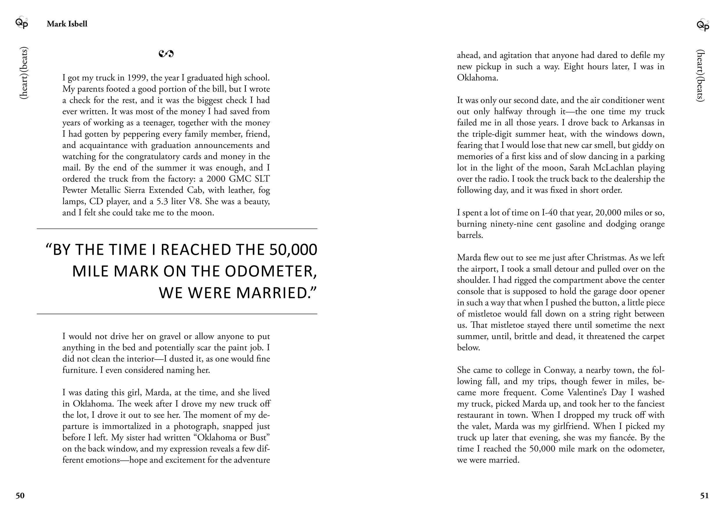
Fig. 8. two-page spread featuring Q&P marker, pull-quote, and side margin formatting, Quills & Pixels, 2013
A Collective Introduction
Once the template was finalized, a master copy was distributed to the students. We were divided into groups by section and everyone was responsible for importing the content for their section and formatting that content according to the template.
Our final major assignment for the semester was composing an introduction for the journal. Like the previous assignments, everyone composed their own introduction and Dr. Anderson combined them into a single cohesive piece (Fig. 9).

Fig. 9. Forward from Quills & Pixels, 2013
The Finale
Some of the students had trouble using the template because of the paragraph styles and master pages, so I volunteered to work with Dr. Anderson and make sure everything was formatted correctly. During this final stage, I worked with Dr. Anderson to created the Table of Contents design and color scheme for the journal (Fig. 10). I modeled the journal’s cover after the divider pages, using white as the border for the cover to contrast the color used on the inside (see slideshow at the beginning of the case study).

Fig. 10. Table of Contents from Quills & Pixels, 2013
The reward
This was my debut into the world of publishing. Prior to this experience, I had taken some classes that discussed various aspects of the publishing industry and even created some mock books for those classes, but this was the first time I would create something for mass production. And as it turns out, this would become a stepping stone to larger publishing projects.